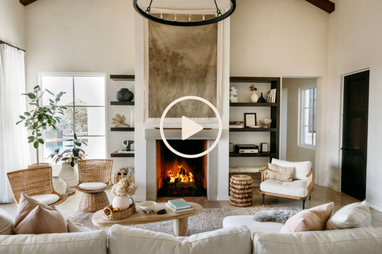
It’s hard to believe that it’s been 13 years since we built our house in Austin. I’ve learned so much through designing these rooms and allowing them to be my canvas for creativity and discovery—and the house has evolved right along with me. Adam and I joke that the minute we think that everything’s finally “done,” we suddenly notice some new corner of the house that needs an update or subtle refresh.
And really, I wouldn’t have it any other way. For me, the best kinds of homes are ever-evolving, and by crafting a home that reflects what’s meaningful to each of us, we can create a place that empowers us to live more authentically, joyfully, and carefree. It doesn’t happen all at once—designing a home that we truly love takes time.
Recently I was looking back at some old photos of the house from when we first moved in, and let’s just say… it’s come a long way.
So, grab a drink, get cozy and watch the video below as I relive some of the biggest design “mistakes” I’ve made to date. And, all the design lessons that I’ve learned to make our home what it is today.
Design mistake: Installing too many built-ins
When we worked with our architect to design our house, we decided to add built-in shelves and cabinetry throughout the offices, living room, and kitchen. It was great for storage—but not so great for adapting and rearranging a room over time. Built-ins are pretty permanent, and not nearly as easy to change up as furniture. A decade later, my tastes had changed and there were certain built-ins that made the spaces feel too closed off and heavy. I wanted to open things up and give a little more spaciousness to the rooms.
The fix: Remove built-ins and embrace a simpler aesthetic
In my home office, we demoed the built-ins and replaced them with a simple desktop that maximizes the space and allows me to restyle it with different furniture and accessories as my taste evolves. It also maximizes the light, and creates a sense of spaciousness and simplicity that feels more aligned with where my style is today.
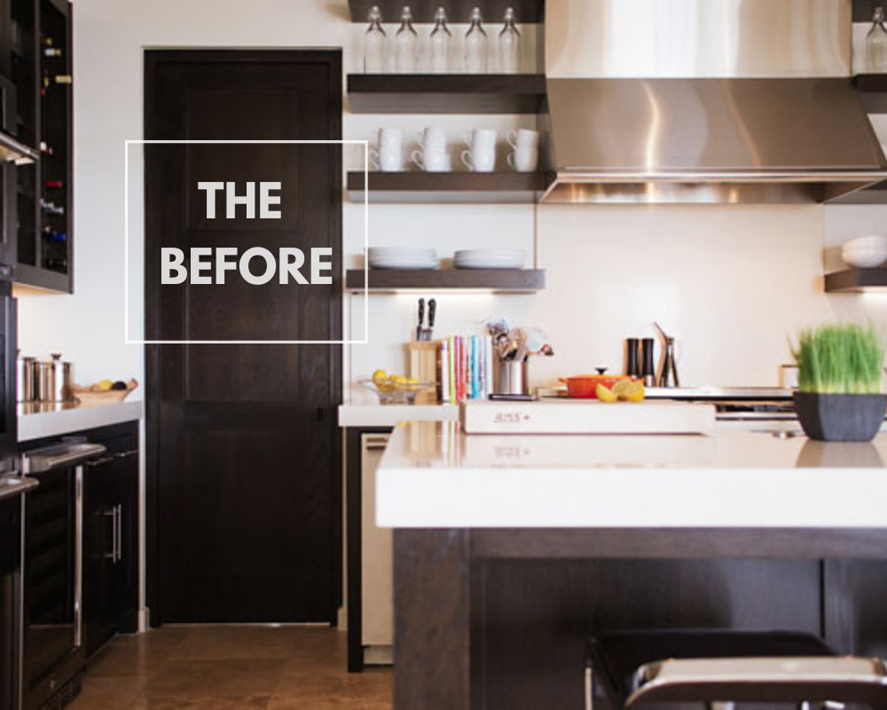
Design mistake: Designing the kitchen without any windows
This is probably my biggest design regret, since I spend so much time in the kitchen and it’s the one place in our house that doesn’t get a ton of natural light. To be fair, this design tweak would have meant reconfiguring the entire floor plan of the house. Our current kitchen doesn’t have any walls that connect to the exterior—but I wish that I’d prioritized a big kitchen window when we first started the process of designing our home.
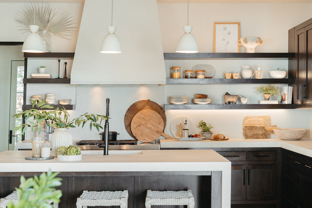
The fix: Lighten things up with white plaster and less shelving
This “fix” illustrates that sometimes, it’s cost-prohibitive and/or unrealistic to really fix the issue, and you just have to go with the next best solution. Our homes will never be perfect in every way, and that’s totally okay. For this challenge, I brainstormed some affordable tweaks I could make to our kitchen that would let in as much light as possible.
First, we replaced our heavy stainless steel hood surround with a custom surround made of white plaster. It’s so much brighter and reflects any natural light coming into the space.
Then, we demoed some of the heavy dark wood shelving to open up the space and allow for more light to reach this back wall of the kitchen. We removed the top shelf and took out a panel of upper cabinetry. You can read more about our mini kitchen remodel here.
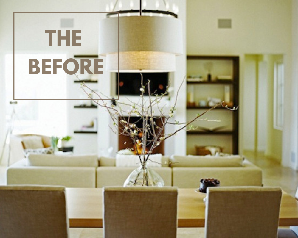
Design mistake: Putting a TV over the fireplace
When we built our house, we assumed we “had” to put a TV in the living room because… well, that’s what everyone else did! At the time, it was the only space in the house we’d designated for lounging, so it seemed like the obvious spot. However, this is also the area of the house that you see right when you walk in the front door, and our big flat-screen began to feel like an eyesore that drove my design eye crazy. I didn’t want a black box as the focal point in the main living area of our house.
Plus, in an effort to make the TV look more streamlined, we’d designed the wall with an inset alcove to house the TV and make it flush. But since it wasn’t sized perfectly for the TV we ended up buying, it ended up looking kind of awkward.
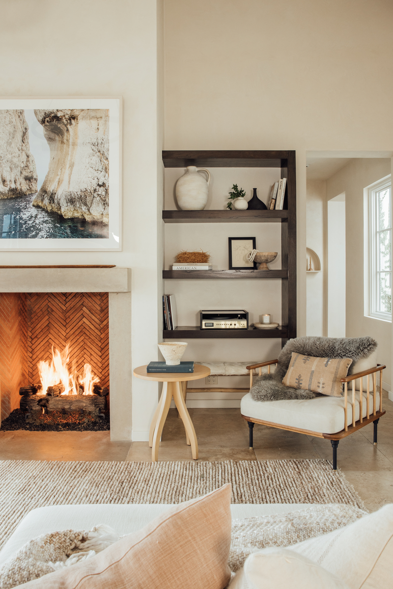
The fix: Throw out the “rules” and design your space how YOU want to live!
When I asked myself how I really wanted to use our living room, I realized that I wanted it to be a space to unwind, relax, feel inspired, and gather with friends and family. So, we redesigned the layout of the living room with those goals in mind. We removed the TV and filled in the alcove, then plastered over it to match the rest of the wall so we could hang a big piece of statement art.
Then, we converted a little-used room with workout equipment into our family TV area. It’s small and cozy—the perfect spot for our family movie nights.
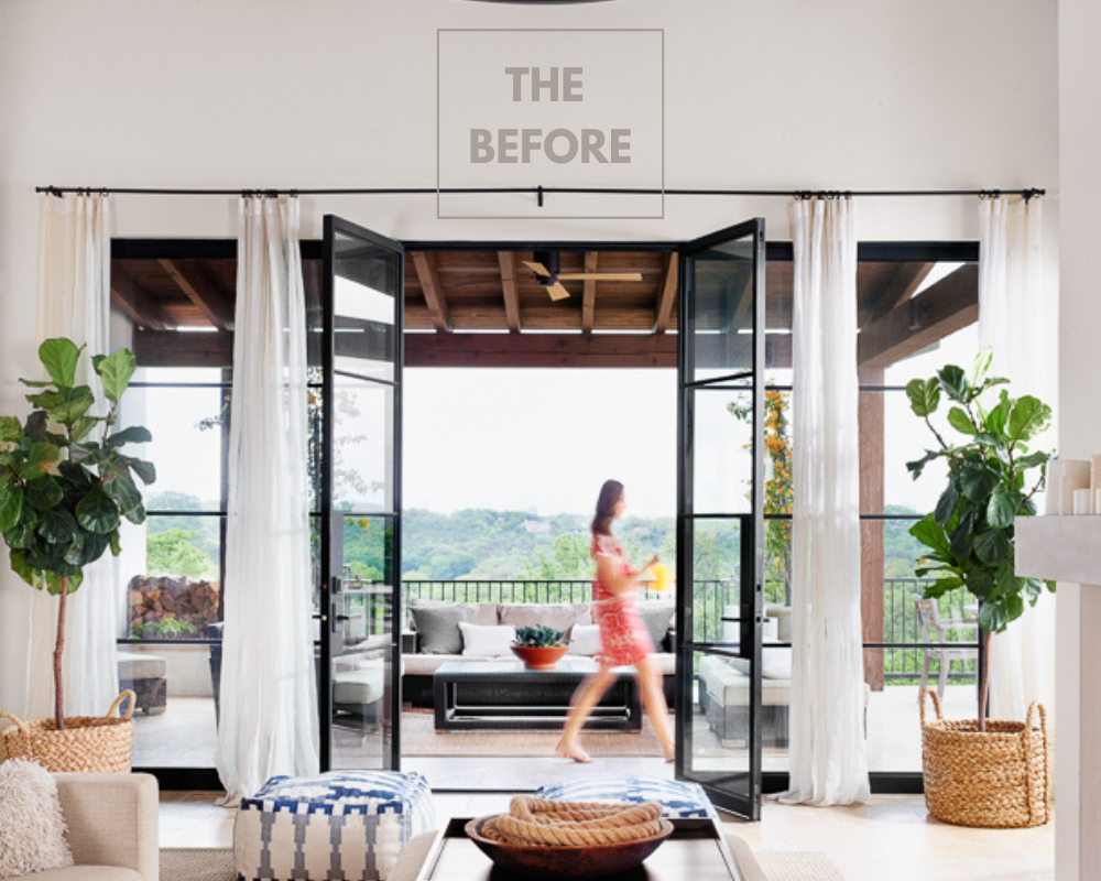
Design mistake: Decorating too matchy-matchy
When I first started out in my design journey, I didn’t have as strong a sense of my own taste as I do now. And since I wasn’t as confident in my own design eye, I found myself following rules that I’d read about or see in other spaces. I thought that everything needed to be symmetrical, and that furniture in a room needed to match! The result was boring, predictable, and lacked any sort of real soul and character.
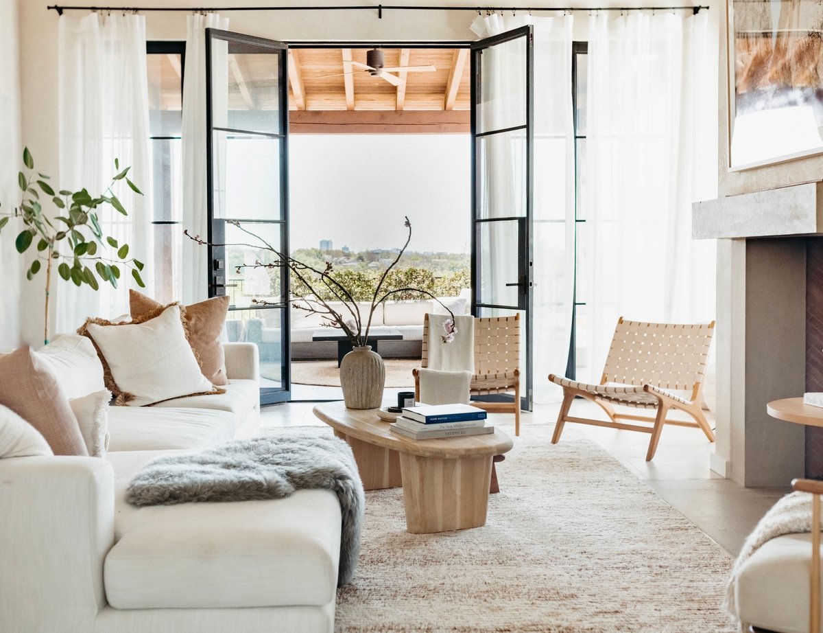
The fix: Infuse your home decor with a sense of play
Over time, I gained the confidence to play and have more fun with my decor. Adding texture, playing with asymmetrical compositions, going with what I liked instead of what felt so expected. Now my home feels more multilayered, textural, warm, interesting… and so much more me!
***
The biggest change to my home through the years? Instead of following trends, I start with deciding how I want to live and feel in each space. It’s helped me reprioritize the things I purchase, letting go of the “rules” I once followed and instead putting comfort and connection at the center. Instead of just another Pinterest-worthy space, my bedroom has become my sanctuary, the dining table a place for real-life connection. It’s a journey that I know will keep evolving, just like me.
The post Are You Making Any of These Design Mistakes? Here’s How I Fixed Them In My Own Home (Video) appeared first on Camille Styles.


0 Comments